
Hawkins Construction
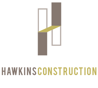
As I worked on creating a mark for Hawkins Construction, I wanted something that was so simple that a person off the street would be able to recognize one of the company's trucks driving by. I decided to work with the first letter of the company’s namesake. Then it came down to how to best represent the letter in the context of construction. The mark came together as a result of rectangular planes that connect to create the letter H. My interpretation had to do with how architecture and construction are byproducts of the intersection of planes and surfaces, creating livable spaces.
If you allow your eye to wander, there is a visual illusion created by the color blocking and positioning
of the planes where you can see the H from two planar perspectives. Additionally, there’s a lower case (h) that’s hidden in the overall mark.
of the planes where you can see the H from two planar perspectives. Additionally, there’s a lower case (h) that’s hidden in the overall mark.