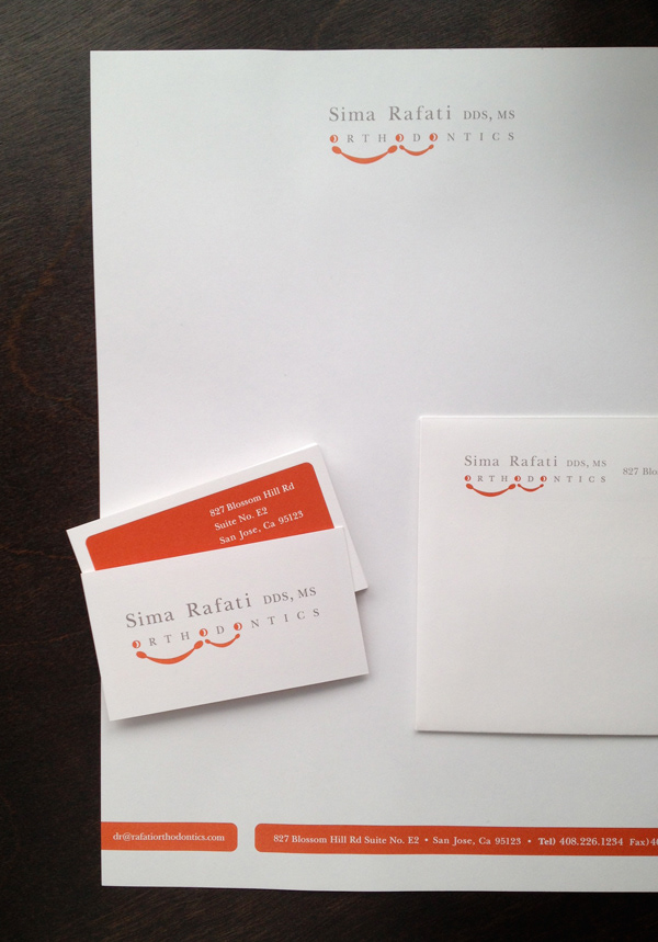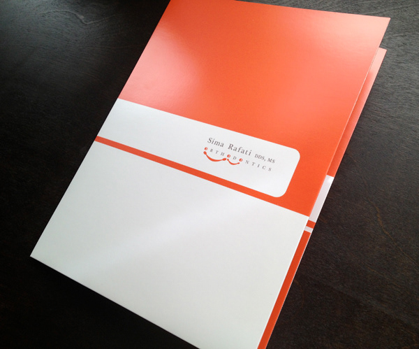
Rafati Orthodontics
Creating branding for an orthodontic practice based in San Jose, needed to be both professional as well as playful. The founder's name made up much of the logotype and needed to have a sense of formality, so I worked on interjecting elements of playfulness in the second tier of the logo. The focus was on modifying the O's to create smiling faces that are at the core of the work done by Sima and her staff. The little smile looks to the bigger one, eluding to the generational attributes that make up Sima's client base and the idea of delivering quality orthodontic care that allows a smile that grows.